With rumors about upcoming changes to the way the app presents playlists dating back to May, YouTube Music is now receiving a little design makeover. Prior to Android 13’s major release later this autumn, google is also testing a dynamic queue feature for the app and adding support for its media controls. It was just a matter of time after the playlist UI makeover of the YouTube Music app for tablets last month that the feature was added to phones as well. That appears to be occurring right now, said one Reddit member.
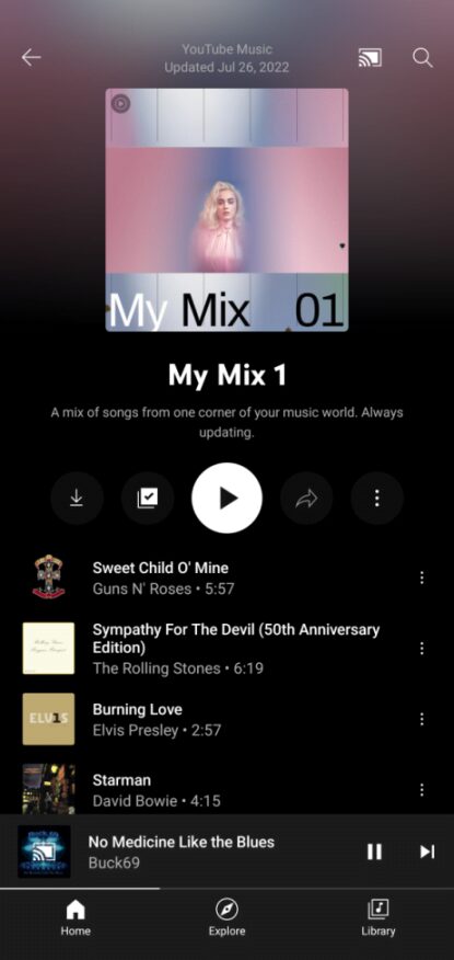
A screenshot of the new YouTube Music playlists for phones was uploaded by Reddit user u/ungiancarlo, and it doesn’t appear all that different from the tablet revamp from last month. It doesn’t appear to be broadly accessible now, but we anticipate that over the next several weeks, more devices will start to receive it. Additionally, as 9to5Google notes, the shuffle floating action button (FAB) is concealed in the playlist’s bottom right corner.

The UI now allows for a bigger album or playlist cover picture, as seen in the snapshot above, with information about the playlist’s author and the most recent update date displayed on top. Right beneath the cover picture are controls for download, editing, play/shuffle, sharing, and a three-dot menu with choices for deletion and playing the track next, among other things.
Similar to how YouTube Music albums and playlists were redesigned for tablets, playlists appear to be getting the new look first, with albums likely following later. Given that the previous UI has been in use for quite some time, the change will undoubtedly take some getting used to. Why the YouTube Music team is taking so long to update the UI on both its tablet and mobile applications is a mystery. Regardless of the sort of device they own, customers of the music streaming service should soon be able to experience the same UI.


